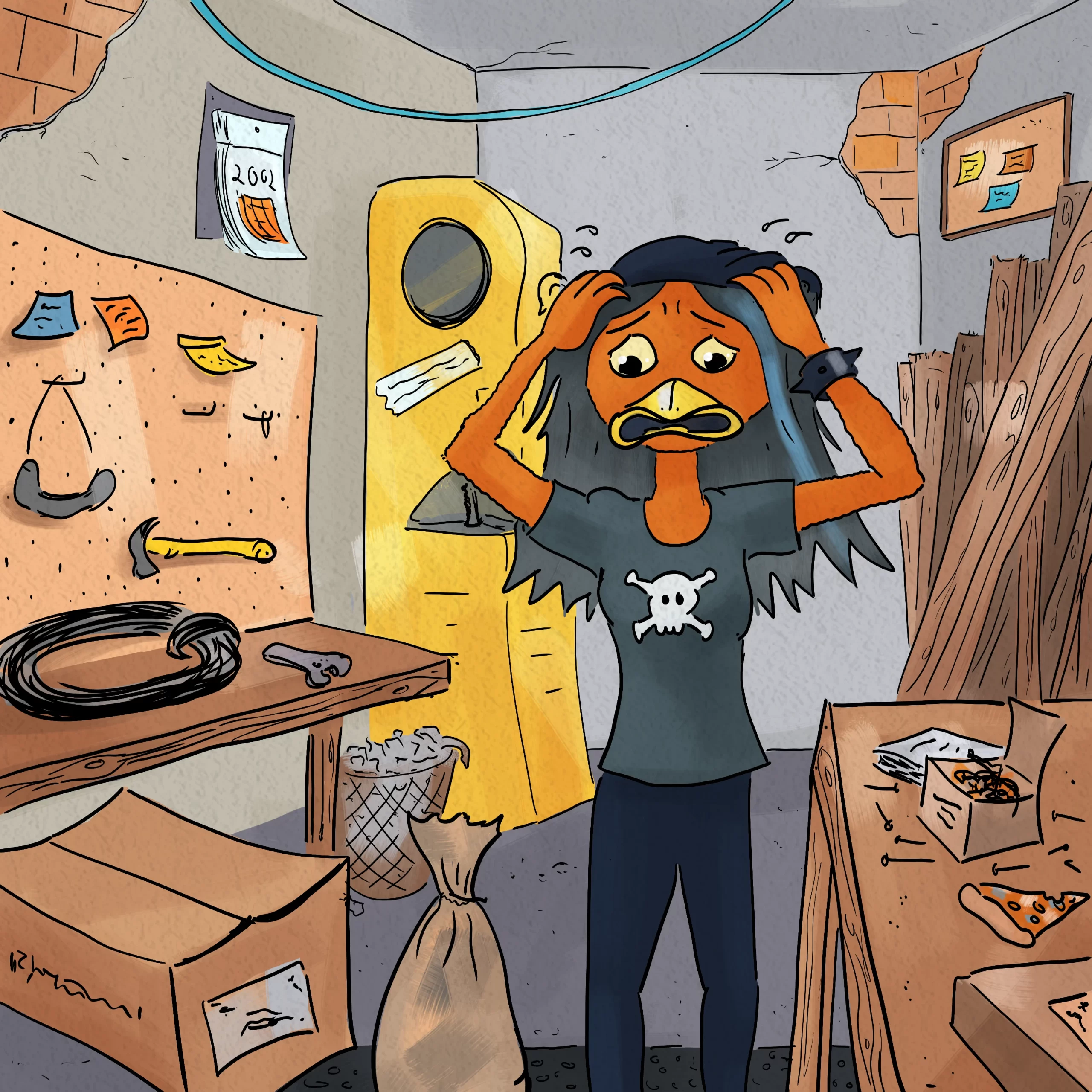
Everyone knows that collecting and analyzing data can help you make more informed decisions. But did you also know that your data presentation can mean the difference between winning and losing in many business situations?
This was news to Gary.
If you’re a regular here at Zattatat, you know that Gary is now down to working part-time in his old career (accounting) while getting his baking business off the ground. His favorite thing to make (and eat!) is cookies.

Anyway, recently demand for the cookies has been ramping up which is great. But demand has actually been getting so high that Gary is having trouble figuring out how to make enough cookies without having to buy another industrial oven, his line’s bottleneck. That would be extremely expensive and his bakeshop doesn’t really have space for another one anyway.
Gary’s employees told him that they were filling the oven as full as they could for each batch without the cookies coming out unevenly baked, but Gary wasn’t convinced they’d considered every possibility.
So he decided to take a look for himself
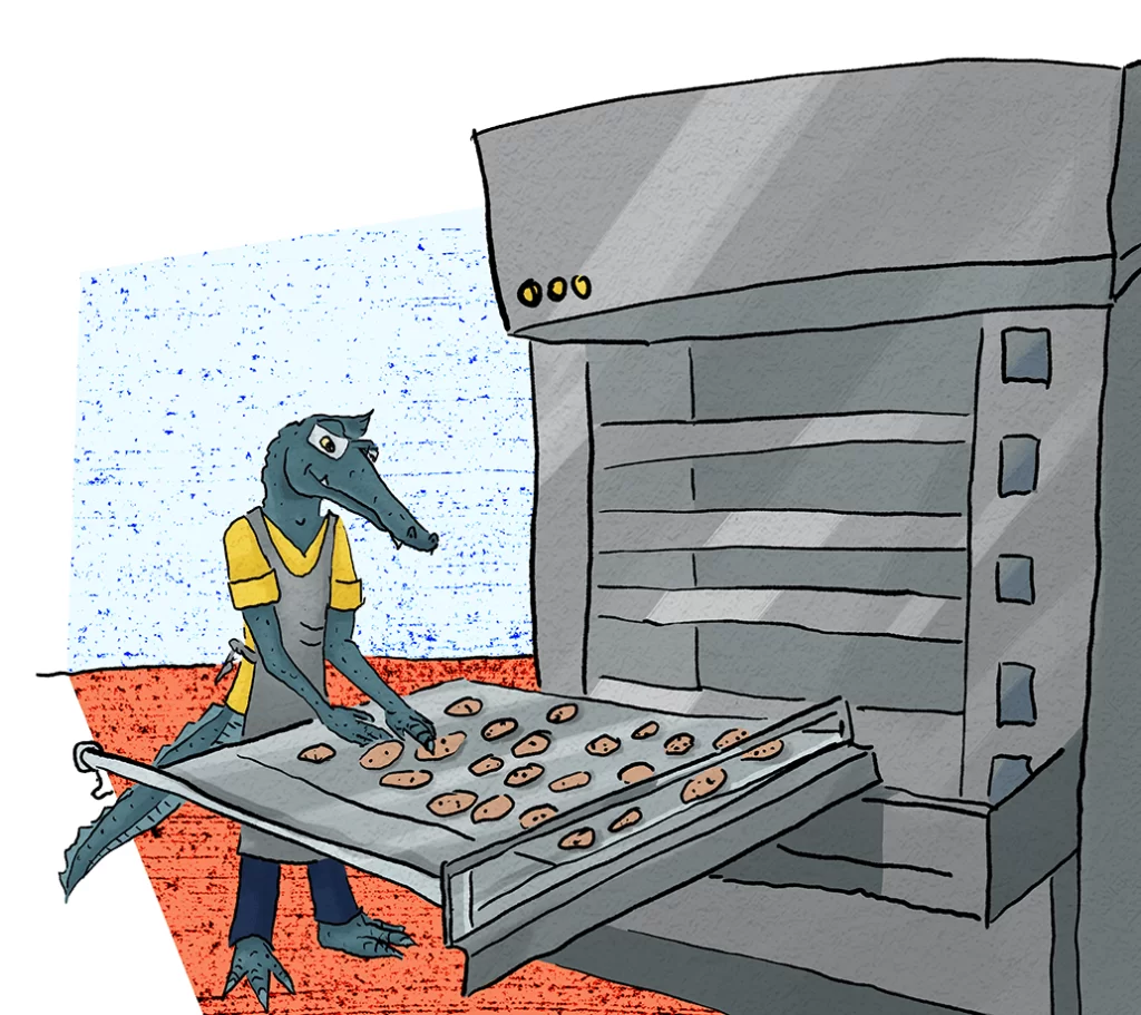
Anyway, after trying many iterations of cookie density, oven temperature, and baking time, Gary figured out the optimal combination that would allow them to produce the maximum amount of cookies without having to buy another oven or sacrifice cookie quality.

But they didn’t actually listen!!!
Despite the information that Gary shared, his employees kept following their old protocols. Gary was furious and ready to fire them ALL. Luckily, he decided to consult with his friend Process Cat first.
PCat talked him down off the ledge and got Gary to realize that just because he was the boss and the owner of the company didn’t mean that he could completely get out of needing his employees’ buy-in. And to put a finer point on it, Process Cat told Gary,

Your data presentation kinda stinks.
It was true! Gary had simply tried to tell his employees what he’d discovered about oven temperature, sheet pan capacity, and cookie quality without actually showing them the data.
And while it was easy for Gary to get angry and blame the employees, he did ultimately realize that the fault lay partially with him for not having clearly communicated what he’d learned from his experiments.
If he had given his employees clear work instructions (a topic we’ll be covering soon!) and they’d ignored them, that would be a different situation. But in this case, Gary had merely shared his observations in an informal way with the supervisor of the baking team and… the guy was busy and he didn’t quite absorb it all.
So with Process Cat’s encouragement, Gary didn’t jump to immediately fire all of his employees. Instead, he took the time to…

- Schedule a sit-down meeting
- Use visual aids to communicate the data
- Summarize his results verbally
- Communicate his instructions in writing
And Gary’s data presentation paid off!
Once Gary’s bakers understood exactly what he needed them to do and why, they had no problem adopting the new procedures and their output of baked goods was able to keep up with demand!

Weekly Challenge:
Are you doing the best you can to present your data clearly and compellingly when you have people to convince? If not, consider spending a little more time organizing and presenting your data – and don’t forget, when the people you’re trying to convince are potential investors, customers, or business partners, you’ll probably have even less of a window for mistakes in this area!

